Logo

Installed Posters and Flyers


Process


Artist Statement
My work explores multiple mediums while crossing the lines between reality and fiction.
I have had an interest in art my entire life, drawing regularly as early as three years old. I primarily work digitally; however, I also have worked in physical mediums such as graphite, wood, metal, and various paints. As I work toward becoming a graphic designer, I want to expand on elements of typography, digital design, texture, and color. Now, I am working to become proficient in as many different fields as possible and find myself enjoying the process of learning.
I love working with technology and using digital creative mediums. The majority of my works are created using multiple design programs, leading to the creation of typographic works for screens, three dimensional models, brand mockups, websites, and motion graphics. My commercial oriented works focus on ideas of following geometric form to create bold, eye-catching iconography akin to the ideas of the Bauhaus. I use the foundations of Modernist graphic design to create forms suitable for products. My applications use flat color and simple forms to create something that is easy to recognize.
There are many people who influence my work and the subject matter, such as the futuristic environments and signage of Syd Mead or the kinetic movement of Keith Haring. Virtual worlds and science fiction are a common muse for my digital works. Ideas of combining nature with technology are recurring themes in my work. My physical pieces are typically more grounded in reality, focusing on capturing the essence and look of a place or person.
I particularly enjoy works that involve geometric forms, appearing fractured at times, using these ideas to create works focusing on themes of self-reflection. By using simple forms, color selection, and silhouettes, these fragmented works offer a way for the viewer to see themselves with my silhouette pieces offering a sense of uncertainty.
I believe it is worth making works from ranging perspectives and subject matters, including topics that are serious and ones that are simply explored for the audience and artist’s enjoyment. There is much value in leaving a piece's meaning up to interpretation. I keep taking risks and attempting to work in new avenues as I practice new techniques as a young artist.
Art Intervention Project Final Presentation & Feedback (on 12/4 & 12/11)
POSTS by 12/4 (for those of you who signed up already) and 12/11 (for everyone else)
PRESENTATIONS ON 12/4 & 12/11
It is time for our SHOW & TELL!
1. Prepare a 3-minute presentation of your process & intervention showing:
2. Title your post "Final Presentation / [Title of your art intervention] / [Your name]."
* 1/2 of our class will present on 12/4 then the other 1/2 will present on 12/11.
Presenters signed up for 12/4: Abby, Rocco, Pedro, Cici, Evan, Taina, Fatima
Instructions and materials for S.M.O.G. (Solar Monitored Octane Generator)
1. Materials
The posters will be printed on 13x19 paper, 4 posters total
The flyers will be printed on 8.5x11 paper, 8 flyers total
Posters
- 13x19 Paper
- Printer Ink
- Thumbtacks or Tape, Clear Tape Preferred
- Bulletin Board or Public Walls
Flyers
- 8.5x11 Paper
- Printer Ink
- Tables in Public Locations
2. Images


3. Instructions
Poster
- Walk into either the Visual Arts Building at NJCU or the Science Building at NJCU
- Locate a bulletin board or wall where posters are already being hung.
- Use the thumbtacks on each corner to make sure that the poster is flush and doesn't get damaged by people walking by. If using tape, tape each corner either using clear tape or by folding colored tape and putting it behind the poster so that it cannot be seen.
- If a bulletin board is found, use thumbtacks to hang the poster to the wall. Be sure to leave space for other posters and that the QR code is visible.
- If a public wall is found, use the thumbtacks if allowed or tape to hang the poster. Make sure that any tape used is not visible.
- Ensure that the poster is mounted at chest or head height to ensure that it is readable and accessible.
Flyer
- Walk into either the Visual arts Building at NJCU or the Science Building at NJCU
- Locate a table either with empty space or one that is already being used to hold flyers and pamphlets.
- Leave a stack of flyers on the table, facing the reader so that it could be read from a standing position.
- Ensure that the flyers are easy to reach for anybody who wants to take one for themselves.
How is S.M.O.G. going to be presented to viewers?
My project is going to consist of a poster that leads to an outside resource, likely a YouTube video, that discusses the project S.M.O.G. in a way that initially presents it as an innocent climate project, then eventually ending as something that looks very satirical. The choice to make a video instead of website is both logistical in the fact that this would take less resources to do, and the fact that this would then allow people to respond to the project through comments and take it as something to think about rather than something to directly act on.
The Poster
The poster is going to be placed in specific locations at NJCU, with some in the Visual Arts Building and some in the Science Building. In NJCU buildings, there are often tables that people use to hang out and work, as well as boards that can be used as space to put posters. These would be printed at 11x17 for hanging, and 8.5x11 if meant to be placed on tables in a higher number.
The poster itself would look more innocent with subtle clues to the project's true nature, with phrases such as "I love smog" existing to provide a sense of irony that would be paid off with the video's contents. The physical forms would be left alone for people to interact with, with a QR code available and a YouTube channel set up to be searchable with the video on it.


Hello Martin Kruck;
My name is Rocco Francisco, I am a senior here at NJCU currently pursuing a B.F.A - Graphic Design degree. Thank you for answering my questions in the past regarding my schedule and course opportunities. I wanted to ask about installing posters and QR codes across the art building to draw attention to climate change and environmental issues.
I am currently working on a project titled "S.M.O.G." which is a satirical and fictional brand that addresses climate change. Exploring topics like climate change and acting as a criticism of consumerism, the Solar Monitored Octane Generator is a fictional product that actively harms the environment under the guise of "returning to the glory days" and "aiding in climate change efforts." By taking the idea of a product that affects the environment, and specifically making one that harms it, this calls to attention issues in the environment while also directing a sense if irony towards products that market towards people who are conscious of climate change while also directly harming it, like the issues with lithium batteries.
The project would consist of posters that have a QR code linked to a mobile website displaying mock-ups of the model while slowly increasing in absurdity the more a person reads into the project. Taking inspiration from The Yes Men's Survivaball project, the irony of the project would allow the audience to conduct their own research on the topics being satirized. There may also be opportunities to have some posters placed in NJCU's science building; though environmental science degrees have been sunset, people studying in STEM would also be an appropriate audience for the project. There is an opportunity here to draw attention to climate change and the products that are negatively influencing the environment.
Thank you,
Rocco Francisco
 |
Ashley Robinson is a photographer who practices techniques that involve manipulating the subjects of her photography, color techniques, experimentation with cameras, and exploration of form.
Ashley's work from the "Final Digital" collection is a set of photos that carry extensive texture, bright colors, and motion. This is a piece that uses a digital camera to capture framed images of sculptural works that Ashley had previously made with paper, metal wire, plexiglass and her own body. The motion effect was captured by taking photos with a slow shutter speed, which when combined with the multiple colored lights creates an effect of colors appearing to separate from one another. These images are close and intimate with their subjects of focus, offering close-up compositions of these textural and color based elements.
When viewing this work I originally thought that there was going to be a much deeper meaning to it. The amount of care put to the details presented had me wondering what the significance of each element was. However, by Ashley's own admission, the choices were more the result of experimentation and seeing what would work. Describing herself as a "colorful person," the colors were a result of her own personality and aesthetic choices. The fact that these pieces were the result of experimentation and trying new things does not mean a piece with no meaning; Ashley's passion shines through in the deep exploration of her craft.
I was especially impressed by the lack of digital editing tools in her work. On first glance, my background as a graphic designer immediately had me wondering what tools were used to achieve specific effects, such as the chromatic aberration of the colors or the blurring of objects. However, I was very pleasantly surprised when Ashley revealed that she actually doesn't enjoy using digital editing tools and prefers to work hands-on with her photography. The resulting photographs were entirely created manually by hand with thoughtful execution, another sign of Ashley's passion and attention to detail.
I entered this collection looking for a "deeper meaning" and left with the impression of an artist who has a dedication and love for her craft. The steps that she took to achieve these photographs were meticulous, showing that her work is a labor of love. The result of this work is that of an almost ethereal collection.
 |
| from Final Digital, Untitled, Digital Photography, 2024 |
 |
| from Final Digital, Untitled, Digital Photography, 2024 |
 |
| from Final Digital, Untitled, Digital Photography, 2024 |
 |
| from Self Portrait, Untitled, Phone Photography, 2024 |
 |
| from Self Portrait, Untitled, Phone Photography, 2024 |
1. About Liquid Trees
My first article on liquid trees was current, as it covered a topic that is still ongoing while referring to climate change issues that are relevant today. However, the article I chose was not covered by a news website, and was instead that of a site called "World Bio Market Insights," pointing towards a possible bias and agenda on the matter.
The article I am choosing to cover for research is that of Euronews' "This 'liquid tree' in Belgrade is Fighting Back Against Air Pollution," as it covers the same relevant topic while being from a news article that avoids economic biases. The "liquid tree" concept installed in Serbia is an example of cutting edge technology being used in order to fight against carbon emissions, evolve public infrastructure, and combine organic life with technology as cities move towards a smarter, technologically driven structure.
2. What did I learn, What Questions Do I Have?
The topic of photobioreactors is as interesting as it is complicated. My own understanding of it relates to that of algae cultivation, light, making the energy usage more efficient as more developments are made, and reducing carbon footprint by generating oxygen and taking carbon dioxide from the air. They are described as "a solution for tackling greenhouse gas emissions and improving air quality" by Euronews (Euronews).
- How does a photobioreactor affect carbon footprint?
Photobioreactors affect carbon footprint by using algae, which uses photosynthesis to make oxygen and use carbon dioxide. By cultivating algae life in a controlled environment, this process can be used to reduce carbon emissions.
- What are the drawbacks of current photobioreactors?
Current photobioreactors use an intense amount of water, with the one in Belgrade being noted as using "six hundred litres of water," a number that is extraordinarily high especially when considering that this is for a single urban installation (Euronews).
- Are photobioreactors an alternative to planting trees and other plant life?
Similar to other ways of lowering carbon emissions, such as wind turbines and solar power, the goal is not to replace everything with a specific idea, but to use them together in order to drive carbon emissions down while looking for renewable solutions to our problems. In this case, photobioreactors can be used to supplement trees by existing in environments that cannot support plant life, like dense urban environments, rather than replace them.
3. Project Proposal - Solar Monitored Octane Generator (SMOG)
While doing research for this assignment, I was thinking to myself, "how could I take my research on carbon emissions and apply it to a separate project without being too similar to my thesis?" After thinking on this for a while and referring back to the Survivaball, my adjacent project would be that of the Solar Monitored Octane Generator, or SMOG. This would take a satirical approach to the topic of climate change and technology.
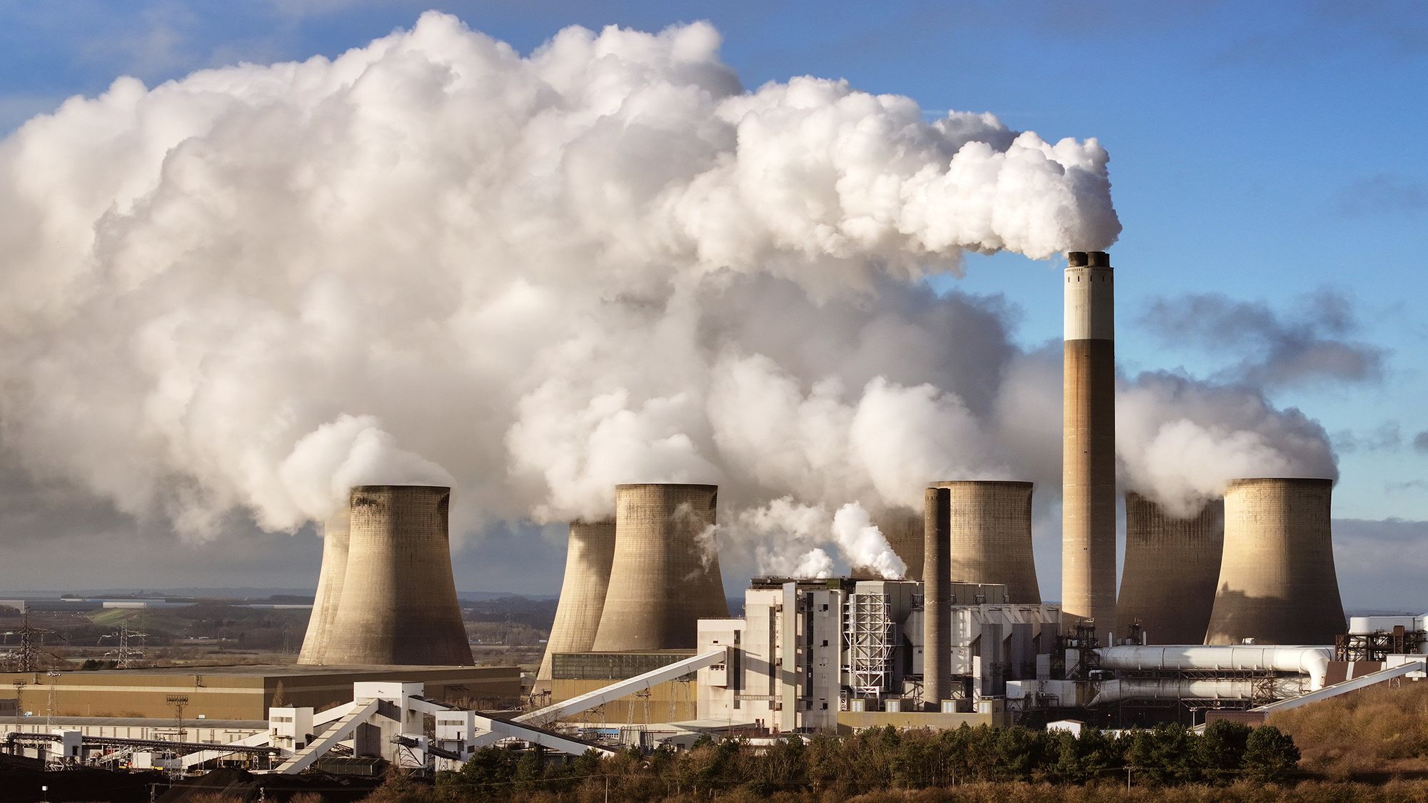
The idea for this project would be to create an ironic fictional invention in the form of a generator whose purpose is to contribute to carbon footprint in a negative way, with even more irony coming from the inclusion of solar power in the process. This would be a fictional product that uses solar power to electronically allow an octane generator to run indefinitely, while having an exaggerated smoke-filled result. The absurdity of the project would be similar to that of the Survivaball.
Articles and Educational Sources
https://www.euronews.com/2021/12/07/this-liquid-tree-in-belgrade-is-fighting-back-against-air-pollution
Kansas State University Article
The Critique Handbook
- Preface
The idea of the rest stop that was talked about in class is referred to in the preface of this book. This idea is that of a critique being a necessary step on the path to success in the studio. In a field that combines multiple cultures, perspectives, and relies on subjectiveness, it is important to understand how to use art school critiques to move forward.
The idea of the art critique is something that is definitely necessary. It is something that I had to warm up to, and something that I imagine most art students had to warm up to, but understanding how to take criticism and use critiques as a resource rather than taking it negatively is extremely helpful while trying to learn the skills necessary to succeed in any art field. Though my own experience might be skewed as a graphic design major, something that makes me think less towards fine art
- Introduction
"But the critique is not a singular goal or deadline. Rather, it is one of many, part of a series of cadences that partition the semester into sections of creative productivity... a marker of perpetual beginning" (Buster and Crawford ix).
Critiques are often looked at as a hard deadline, and this is something that I do myself fairly often. It is easy to overlook the idea that these critiques are building up to something greater over the course of a semester, rather than keeping the scope of a project to just the week or two weeks that are given for an assignment. At the end of the day, these critiques help a student as they learn more about their practiced art form until the semester is over. Critiques for smaller assignments build towards a better final, and are not just isolated assignments.
"the interpretation of art is subjective, and that often winners and losers alike do not necessarily deserve either the censure or the praise they receive" (Buster and Crawford x).
This is an idea that is really important to understand, and I am thankful to have professors that make this very clear in their classes as well. In a topic that is as subjective and divisive as art, it is important to understand that an audience's criticism will come from their own experiences and ideas, but this does not necessarily mean that one opinion is the only opinion. Critiques, then, allow these perspectives to be shared in a way that provides a student with the context they need to learn.